The Lacquer Queen
Thursday, 30 August 2012
OPI Peace Baby
I tend to avoid stark, tippex-like white polishes as all white shades stand out on my dark skin anyway. Peace Baby is a very soft white and runs to an almost off-white shade which lends it more warmth than other white polishes. It reminds me a little of Essie’s Marshmallow but I think Marshmallow is a little warmer. It is definitely attention-grabbing so I always make sure my nails are shaped as perfectly as I can get them. Although it is a creme polish, I needed four coats to reach opacity. However, the formula is slightly thinner than other creme polishes and didn’t result in the polish looking like I’d painted it on thickly.
I used a base coat (as always) before applying the colour and finished off with a coat of Seche Vite.
Comments would be greatly appreciated so let me know what you think :)
Sponge Gradient Nails
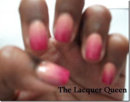
I’m back after quite some time and I’m leaving you with two posts this time. My pre-occupation with my thesis and GAMSAT prep has left little time to add more to this blog. I took some pictures of a really cool sponge gradient effect I tried on my nails a couple of weeks ago and finally found the time to share them with you. Sadly finding pictures that weren’t too blurry to use was a challenge so I am sorry about that. My photography skills are limited as I am a complete novice and I have really shaky hands! I blame my excessive caffeine drinking – a consequence of my student life.
There are several methods to achieve a gradient effect so experiment to find which one works best for you. The colours I used here are OPI’s Polar bare and Miami Beet. Polar bare is probably discontinued now as I believe that it was part of OPI’s Canadian collection. It is a nude creme with hints of peach and pale rose which I thought would go well with a brighter, stronger pink like Miami Beet. I haven’t tried this effect with glitters and my first experiment involving blending a shimmery colour with a creme ended up a mess. I’d recommend sticking to the same type of polish i.e creme with creme.
You might be able to make out a slightly mottled appearance on my nails but this is solved by adding a topcoat. I used my Seche Vite topcoat to get rid of the bumps left behind by the sponge. So here’s how I did it:
After applying my base coat, I painted a coat of the lighter polish onto my nails and let them dry fully.
Once they were dry, I painted a generous stripe of the pale polish onto a foundation wedge followed by a stripe of my second polish right next to the first polish, making sure the edges overlapped. Again you want to use quite a generous amount of polish as some of it will be absorbed by the sponge. My foundation wedges aren’t that absorbent so I only had to apply the polish once on the wedge for each hand.
I quickly bounced the sponge against my nails, letting the polish dry for a few seconds before the next “bounce”. The reason for this is that I found that it smudges and creates an awful mess otherwise. I kept the sponge moving up towards my cuticles, occasionally moving it back down the nail to make sure the colours blended properly and didn’t leave any sizeable gaps.
I have to admit, it didn’t look that great at first. The surface was bumpy from the sponge and the colours didn’t look like they’d blended as seamlessly as I wanted but once I added my topcoat, these problems were resolved.
A slightly blurry and closer look at the finished product.
And another one!
My nails definitely got me a lot of compliments. I have tried painting the colours directly onto the sponge and just sponging on the colours but I found that this method left a lot of gaps in the colour.
So what do you think about sponge gradients? Have you ever tried it and what colour combinations would you/have you used? Your comments will be greatly appreciated!
Thursday, 2 August 2012
Zoya Kalista
Hi!
Today I’m sharing swatches of Kalista by Zoya. I could not be bothered to go the gym today and ended up watching ‘Castle’ episodes whilst painting my nails.
Zoya has gotten some press from magazines like Marie Claire and Instyle but finding their products in the U.K can be a little tricky. It isn’t really widely distributed here and isn’t as available as OPI products for example. Still I love the variety of colours they offer and the fact that their products don’t contain the toxic nasties toluene, formaldehyde and DBP. Cosmetics containing these products are already restricted in Europe. I don’t care how small the percentage of these products absorbed through nail polish is, I don’t want them in my system.
So, back to Kalista….I have to say that this is probably one of my favourite “vampy” polishes. I ordered it expecting a dark brown espresso colour with gold shimmer which was an interesting enough description but I would describe it as a warm mahogany with wine undertones, packed with red shimmer. The colour was applied over my usual basecoat, OPI’s Start to Finish which is a base and top coat. Kalista needs two coats to be opaque but you might be able to get away with just one depending on how thickly you apply your polish. I then added a coat of Seche Vite but I should add that the colour is super glossy all on its own. I just hate waiting for my nails to dry!
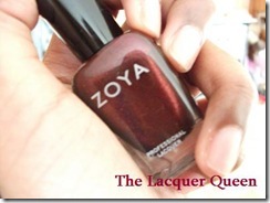
I took this picture in my kitchen while there was still enough daylight outside and as you can see in the picture, before I did my nails. The polish almost looks burgundy in the bottle.
This picture was taken without flash. The colour reminds me a little of red kidney beans…
Kalista with flash. Please ignore the state of my cuticles!
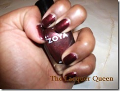
Another picture taken with flash. The colour a lovely bronze toned brown colour in the light.
There are definitely some golden tones there when viewed in bright light but if you look closely you’ll see the shimmer is red, not gold. I don’t know how they achieved that but it is pretty clever. Someone once asked me, “Is that brown or is that really dark red?”. You know what? Sometimes, it is a little hard to tell!
Until next time nail addicts!
The Lacquer Queen x
Tuesday, 31 July 2012
The Quest for the Perfect Gold–Essie Shift Power
A while back I was watching Pretty Little Liars and noticed Hanna wearing gold polish. Not a shimmery dark yellow or pale bronze colour that some companies pass off as gold but a shade that made it look like she’d dipped her fingers in liquid gold with just the perfect balance of yellow to it. I didn’t even know it was possible to get that shade. So, off I went on my search for the perfect gold. The closest I’ve found to a true gold colour is a set of nail wraps called Metallic Gold by Nails Rocks. Sadly since they cost £6.65, I think it’s better to save them for a special occasion.
The next step was for me to find a nail polish that the right tones to it. My skin tone is a bronze colour with yellow/orange undertones. The skin on my knuckles is considerably darker than the skin on any other part of my body so finding the right gold can be a little tricky. Golds either look bronze on me or they are too yellow. I had a look at a few swatches online and finally decided to try Essie’s Shift Power.
I do love my metallics but truth be told some of them are a little streaky. Unfortunately this is true for Shift Power but honestly, it’s not that noticeable in the right light. I loved the coverage. It was opaque with only a tiny amount of VNL (visible nail line) with one coat. I added another coat out of habit and topped with it off with Seche Vite’s Dry Fast Top Coat.
I do apologize for the state of my cuticles! I don’t know if you can tell how horrible they look in these pictures.
What the pictures don’t know are the streaks and the super-fine shimmer that helps give it a metallic appearance.
A slightly clearer shot with flash.
I had some problem with my camera. Everytime I tried to zoom in to get a clearer shot that showed more details, the picture went blurry. I suspect that lighting didn’t help either. I will definitely take pictures in better light next time. It is nearly 2 am and I have work tomorrow so…take care and thank you for stopping by.